Casino Games Gallery
Making
an easy
choice
Understanding Hick's Law

I was asked to redesign the Game Directory Page for this client's website to improve the user experience of the page by making it easier for visitors to find games and the sites where they can play them.
UI DESIGN UX DESIGN
Barriers
- This was one of my first projects putting into practice my recently learned UX skills.
- I received a short brief with superficial UX insights. By that time I thought it was enough, so I settled and started to work with it.
- Time, as it can frequently be, was scarce. The client asked me to consider development time, so my UI redesign had to be “easy to code, yet significantly better than the former one”.
Key learnings
- UX involves constant learning. Keeping up with latest studies, trends, and specific user needs will translate into relevant results
- Iteration also means asking for more data, user insights and feedback. It is OK to request more information (to the client or from users) after the UI has been laid out. At least it is better than sticking to an idea knowing that it could be much better.
Research and current design analysis
This fast project started by doing some demographic research, which allowed me to conclude that the target is male and between 25 and 40 years old. Some benchmarking made me realise about the visual patterns and language used on online casinos and reviews sites. I even had the chance of having a small interview with a friend who happens to play online poker. “Too cluttered” and “So 2010’ish style” were some of his phrases when trying to define what he didn’t like of the sites he usually visits when looking for a new game to play.
With this input in mind, I decided to sketch some ideas over the current page design. Some sections required minor make-over, others were completely redesigned, and even a few removed to make space for visual hierarchy.
New visual style
The client allowed me to propose a whole new style for this page. For this reason, a new colour palette and fonts were presented into the design system.
A new first impression
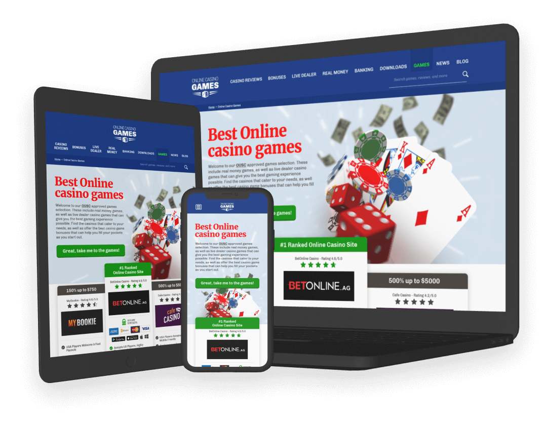
A more explicit active state for the menu links and breadcrumb bar makes it clearer to users where they are. The inclusion of a search bar will encourage users to use it and find relevant content. Now, an impactful hero image welcomes the user with a shorter message and CTA button that scrolls directly to the games gallery. The recommended casino sites section peeks out to encourage users to naturally scroll down. No sidebar, more visual engagement from the beginning the first fold.
Improved featured casinos
The former design had some interesting items, which needed to be standard through the 3 options. But also giving contrast to one of them was crucial. Users respond better to horizontal layouts when comparing options.
Uncluttered and clean gallery
The game directory demanded most of the attention. This new layout sorts categories alphabetically, highlights the most wanted by users, and displays by default the Popular category. Added a basic Sort by filter and search field for a quicker selection. Two featured games layout is an option to feature the best games. Also, the pagination now works as buttons for better interaction.
Game preview
Users can now preview the game before going straight to the page. A few screenshots and a review will let users know what to expect before leaving the site.
Stories instead of sidebars
With engaging headings, the sidebar content is now displayed in a more user-friendly flow. However, links are still SEO-friendly!
Layout that flows
The grid-based design is displayed properly on all screens without compromising any of its virtues.