Miramont
Reach
beyond
barriers
Website for farming experts
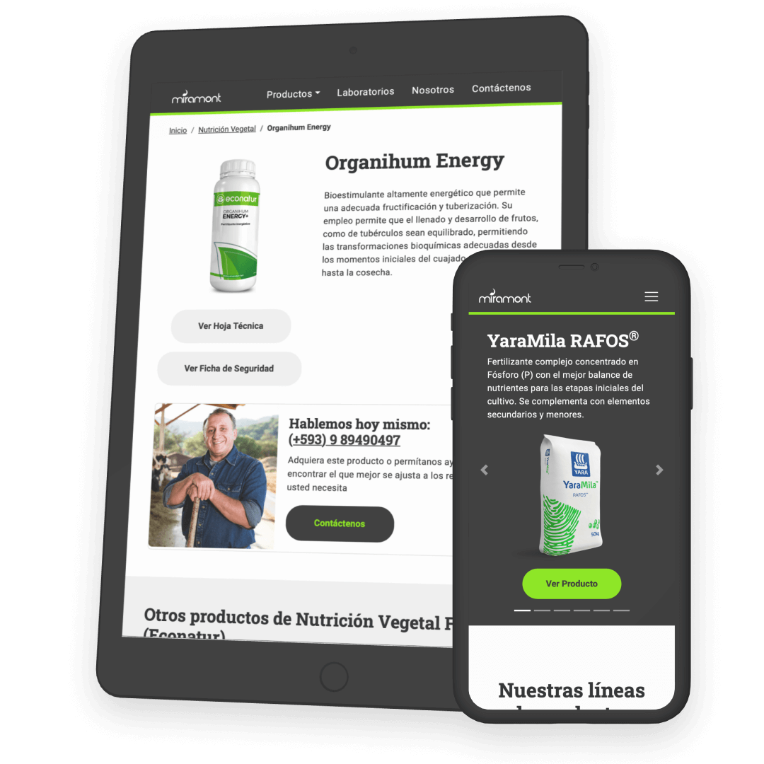
Miramont is an agricultural input marketer company from Ecuador. They asked me to create a website to showcase their products, labs and technical information, but with an optimised mobile-first approach to reach rural users that struggle with low bandwidth internet.
USER RESEARCH USABILITY TEST WIREFRAMING UI DESIGN ACCESSIBILITY CODING
Barriers
- The client was not interested in user research. Stakeholders argued that they already have marketing data that should fit UX needs -which didn’t, ofcourse-.
- There was no budget -or interest- for testing, however the stakeholders wanted to have their say on the IA of the website and any key functionality.
- The product inventory was huge and not well categorised. The client expected me to help them with this and even learn about the business in the process.
- Although users were not supposed to buy online, it was desirable that the website’s product catalogue could easily turn into an e-commerce.
Key learnings
- Although marketing customer research is not the same as UX insights, it can provide some clues and where to focus actual user research.
- Some testing is better than no testing at all. Always. Hallway testing helped me surface some information architecture ambiguities that I became blind to spot.
- Understanding the business, distribution chain and products allowed me to communicate transparently with users, which translates into achievable expectations.
- Advocating for users and evangelising UX practices within an organisation that hasn't met these concepts at all is a tough job. Pushing results of good UX as soon as possible can ease changes.
- Accessibility doesn't necessarily mean designing for a disability. Having big, strong and calloused hands are part of the farmer’s pride, but also an obstacle when operating small touchscreen devices.
Information architecture
As the project started I received a large amount of information from the client: complete product catalogue with technical and security sheets, laboratory history, headquarters details, about us and contact data, etc. So, I decided to categorise all this information initially in two blocks: worth sharing with users and better to keep undisclosed.
First visual approach
With the information to publish, I built category trees with the help of the sales and stock team. Having the content mapped, I felt confident enough to build a low-fidelity prototype: interactive wireframes. I would have liked to test these with actual users, but there was no budget or time, so stakeholders wanted to step in and test it themselves. The results and insights were mostly obvious, leaving the prototype unchanged.
Try the interactive wireframeUnexpected context of use research
During a trip to a small Colombian town that’s known for its coffee crops, I visited a farm where the beans are processed. I met the owner and part of the coffee picking staff, and while shaking hands with a few of them I realised the strong heavy grip farmers have.
Insight This gave me the idea that having big and callused fingers can be an obstacle while using a phone -which according to Miramont’s sales team is the most frequently used device by their users for checking agricultural products-. I also noticed that the mobile data signal was below average, which reminded me of the many times the stakeholder I used to meet complained about the same issue while visiting clients.
Translate findings into facts
Relying on the user’s font size configuration of their phone was not enough, so I decided to design large targets on all task-oriented components: main navigation bar, hero slider, CTAs, filters and download buttons. Once I optimised and received approval on the high-fidelity prototype, I coded it while paying close attention to accessibility standards: alt and title parameters, tab key friendly tags, extended links, optimised and lightweight images, etc.
Empathising with the real users was key to understanding and delivering a product that makes this client standout from the competition with a truly usable product.
Visit the live website